Research to Shipped: Production iOS Tax App for Australian Freelancers in 10 Days with Claude
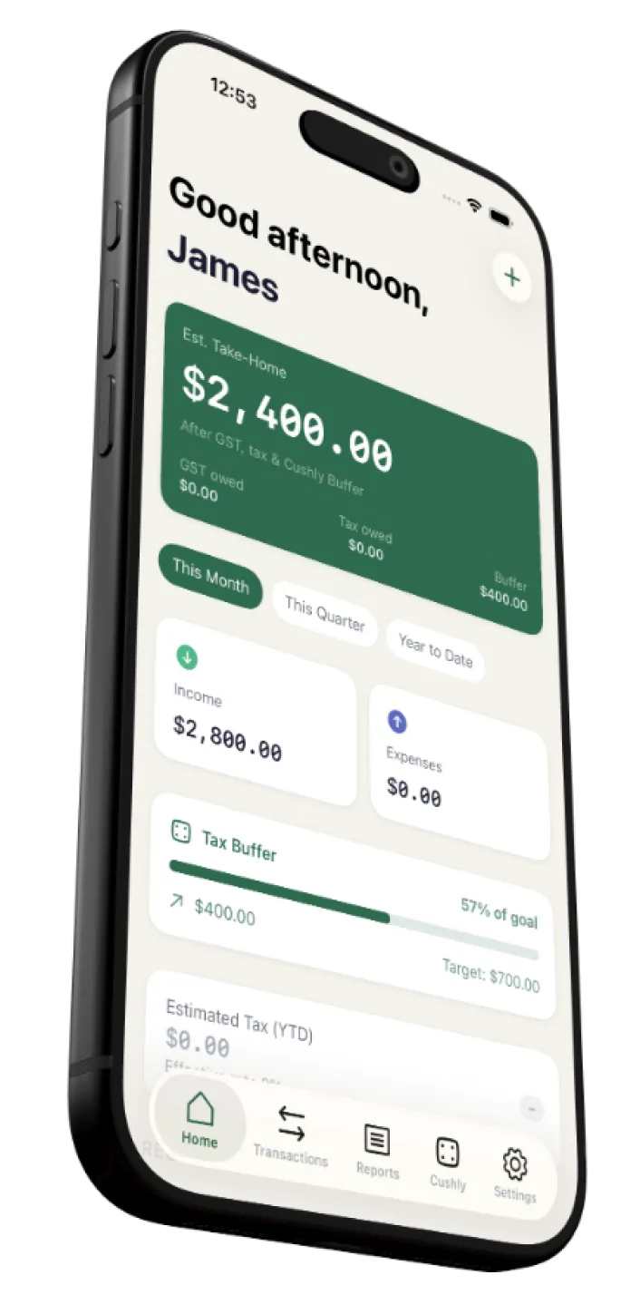
A complete iOS app for Australian freelancers — from first research insight to production SwiftUI code and shipped! — built using a Claude-integrated design workflow.
6
Phases
15
Prompts
10 days
Research to Production + Shipped
CONTENTS
OVERVIEW
A full product lifecycle, compressed into days.
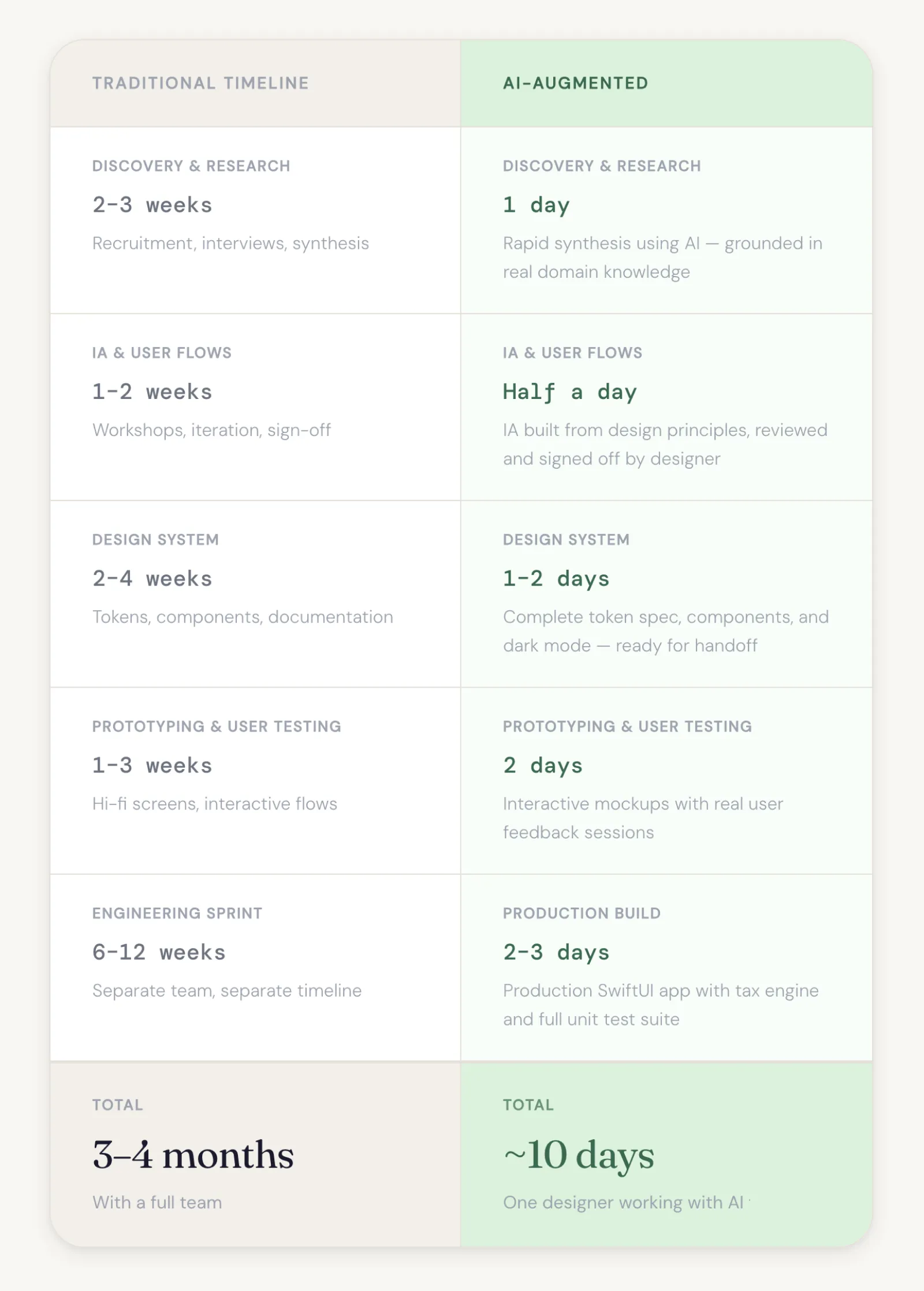
Traditional product design is slow by nature — weeks of research synthesis, multiple stakeholder rounds, lossy handoffs, and engineering that begins months later.
This project moved differently. Every phase flowed directly into the next: research shaped the IA, IA built the design system, and the design system became production code. No handoffs. No long delays.
The result was a complete 6-phase, AI-augmented workflow where I directed and Claude accelerated — delivering a full production iOS app with a custom design system and tax engine, built by one person.
Traditional vs. AI-Augmented Timelines
Understanding the freelance financial reality.
Key Goals
Identify the real financial pain points of Australian freelancers, ground them in specific tax obligations, and map the competitive landscape to find the gap Cushly could own.
Core Tasks
Define the target user: Australian freelancers managing GST and BAS obligations
Identify top 5 pain points tied to real ATO requirements
Frame each pain point as a job-to-be-done
Audit competitors: Rounded, Xero, and Wave
Identify the market gap and strategic positioning for Cushly
Deliverables
5 pain points with JTBD statements grounded in Australian tax law
Competitive analysis across three direct alternatives
Identified product positioning and whitespace opportunity
User profile: smart, capable freelancer and not an accountant
Research brief to inform IA and design decisions in all subsequent phases
AI Tools & My Role
Claude was prompted as a senior UX researcher with a specific audience, domain, and constraint and Australian tax law. I directed the scope, validated the outputs against real ATO obligations, and shaped the competitive framing to ensure it connected directly to user pain rather than surface-level feature comparison.

Five significant pain points mapped to jobs-to-be-done, grounded in the specific obligations of Australian tax law.

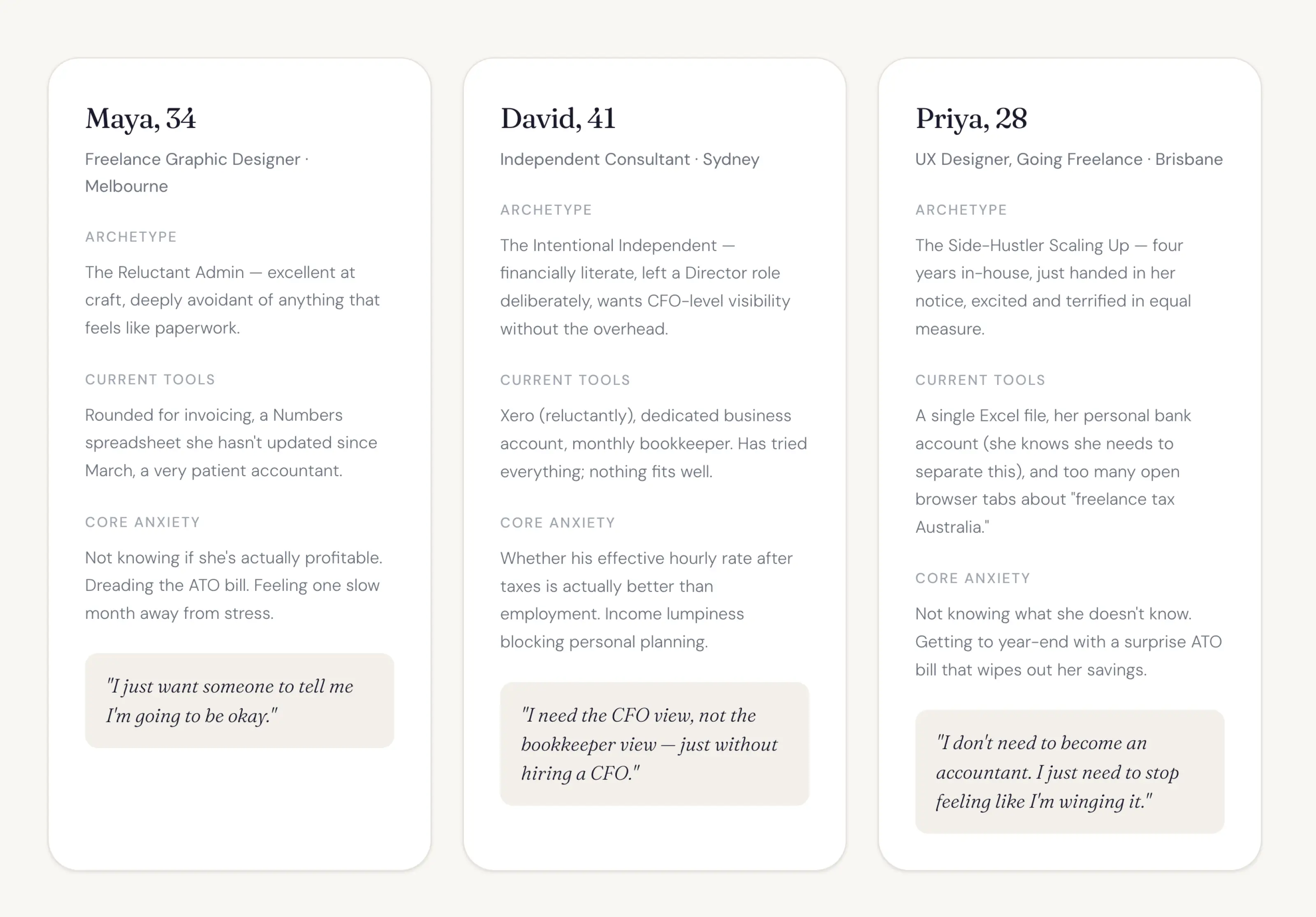
Three distinct user archetypes representing the breadth of the Australian freelance market.
Gaps in existing tools — the opportunity space Cushly occupies that no current product addresses.
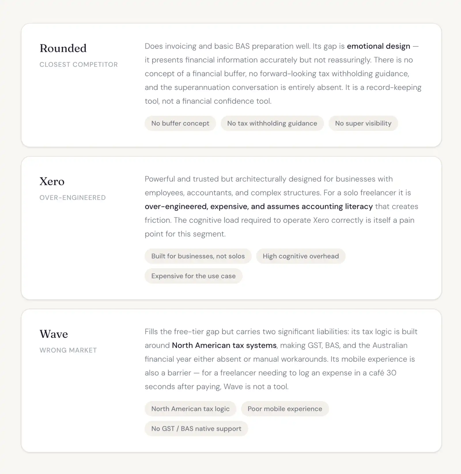
THE GAP WE OWN
None of these tools combine Australian tax accuracy, mobile-first speed, proactive financial cushion building, and calm reassuring design in a single product. The opportunity is not a better accounting tool. It is the first financial wellbeing tool built specifically around the psychological and practical reality of Australian freelance life.
Structure before screens.
Key Goals
Translate research findings into a logical, navigable structure for iOS. Define the tab model, then map the three most critical user flows end-to-end before any screen design begins.
Core Tasks
Design a 5-tab iOS navigation model justified against user needs
Map the "log a GST-claimable expense" flow with every decision point
Map the BAS summary generation flow including edge cases
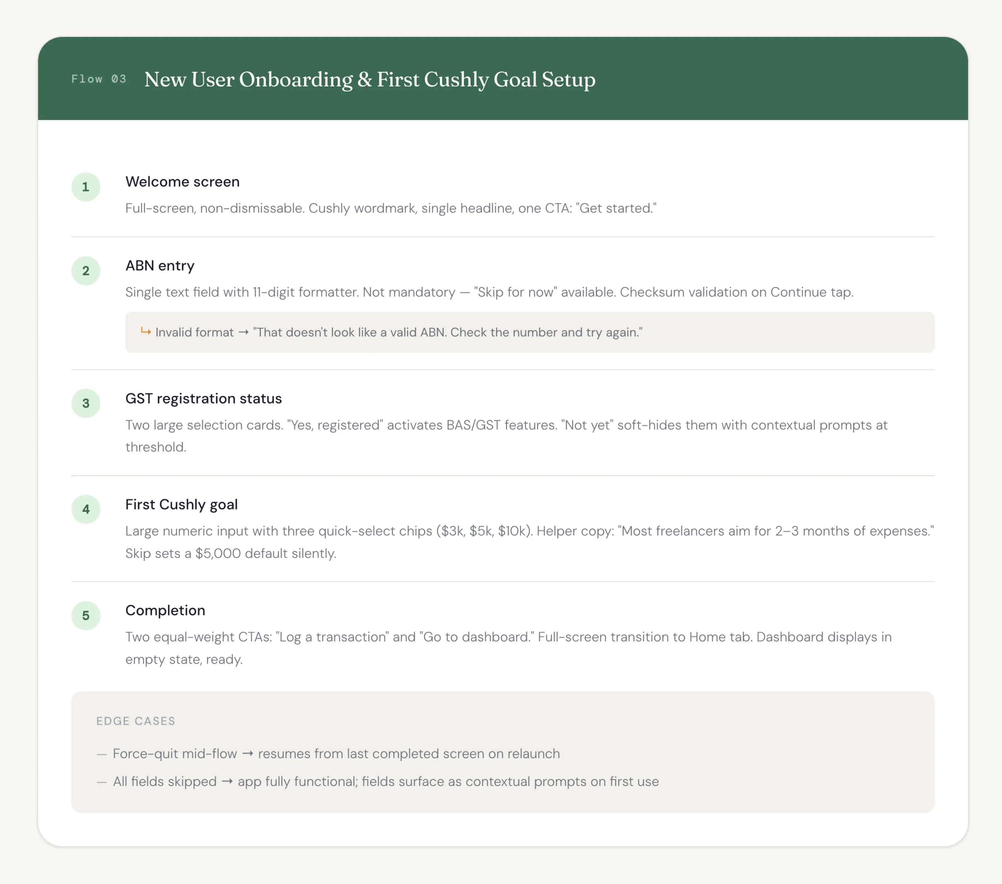
Map the new user onboarding flow with empty states defined
Review all flows for engineer-readiness, not just design clarity
Deliverables
5-tab IA with rationale per tab tied to a specific user behaviour
3 end-to-end user flows with decision points and edge cases
Empty state definitions for all key screens
Onboarding flow with progressive disclosure logic
IA documentation ready to hand directly to the build phase
AI Tools & My Role
Claude received the Phase 1 research output as context and was asked to justify every structural decision against a real user need. I reviewed the tab model for redundancy, stress-tested the flows against real ATO scenarios, and pushed back on any decision point that wasn't grounded in how freelancers actually work.
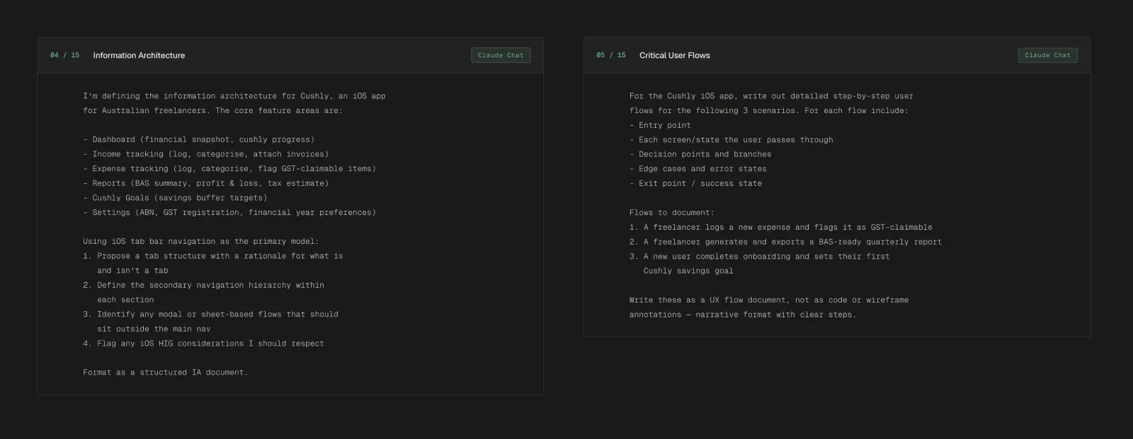
A 5-tab navigation model designed for iOS, with each tab representing a distinct destination the user returns to independently.

Three critical user flows documented step-by-step, including decision points, edge cases, and success states.


Building trust through design
Key Goals
Establish the visual foundation for Cushly, principles, tokens, and a type scale production-ready for Figma and SwiftUI and then apply that system to high-fidelity screens covering every primary flow and state.
Core Tasks
Define 5 design principles with rationale and concrete design implications
Generate brand, semantic, and neutral colour tokens for light and dark mode
Define typography scale, spacing system, and component library
Specify all primary screens in populated and empty states
Design edge case screens: GST toggle logic, BAS summary, onboarding
Deliverables
5 named design principles each with a measurable design implication
Full colour token system: brand, semantic, neutral — light and dark
Design system ready for import into the Xcode project
6 high-fidelity screen specs using live design system tokens
Specs formatted for direct handoff to Claude Code with no annotation needed
AI Tools & My Role
Claude was given a precise emotional brief and asked to derive every token decision from it. I defined the emotional target, reviewed the system for contrast compliance, then directed Claude to apply it consistently across all screens, reviewing every output against the design principles before sign-off.

Five principles that guide every design decision. Each one is a strategic commitment, not a guideline.

A token-based colour system designed for both Figma and SwiftUI, with full light and dark mode support and a core component library.

Claude chat component generation
High-fidelity screen mockups for every primary screen in Cushly, rendered using the live design system token
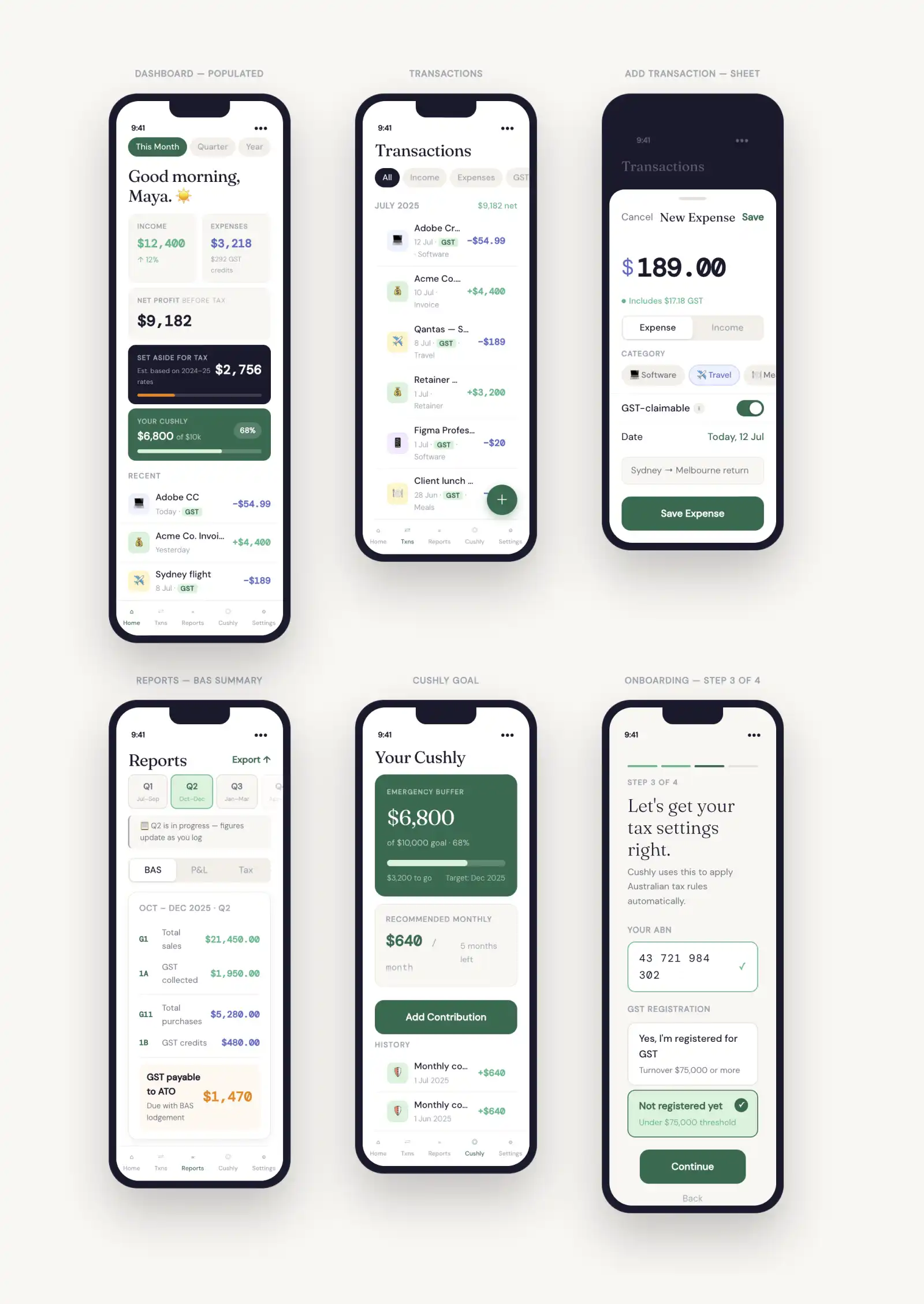
Claude chat screen generation
Figma MCP integration
With the design system fully defined, I created a comprehensive Markdown file based directly on the Cushly brand guidelines. This document captured:
Colour tokens
Complete light/dark mode values for brand, semantic, neutral, and text colours, including WCAG contrast pairings
Typography
SF Pro type scale (6 styles) with sizes, weights, and usage guidance
Spacing
8pt grid system with named tokens (spacingXXS → spacingXXL)
Shape & elevation
Three radius levels and three shadow/elevation tiers
Core components
10 components with detailed descriptions and full state matrices
iOS guidelines
Dynamic Type, safe areas, haptics, and sheet detents
Figma file structure
Recommended folder hierarchy for organising the design system
The Markdown file was then fed directly into Figma MCP to automatically scaffold variables, tokens, and components.
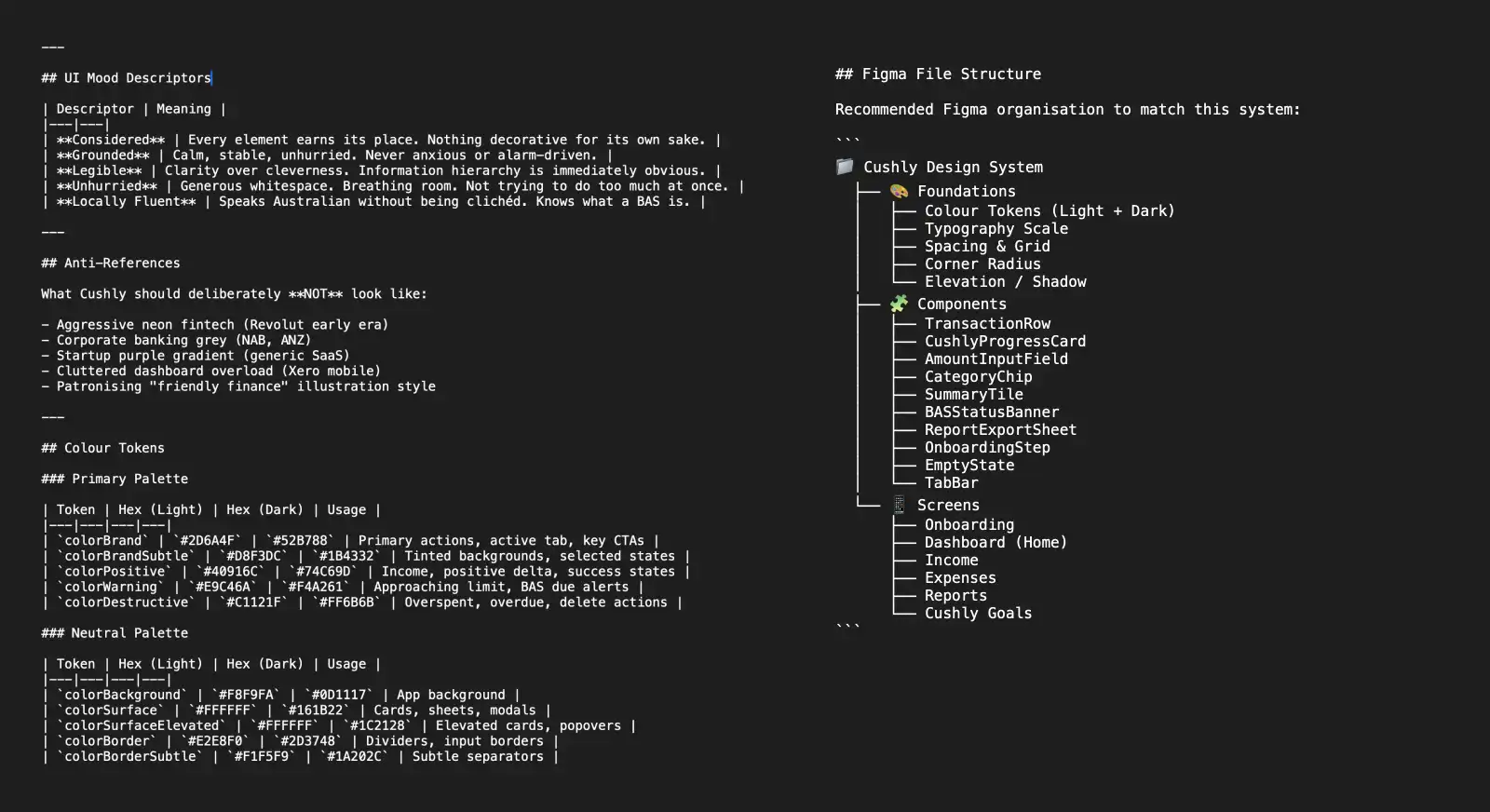
Markdown snippet
I was impressed with the initial Figma MCP integration. Not defining a custom font in the design system turned out to be a good decision, as it allowed me to use SwiftUI’s native Dynamic Type support more effectively. I then refined several components by correcting issues and improving their auto-layout structure.

Figma DS - Foundations
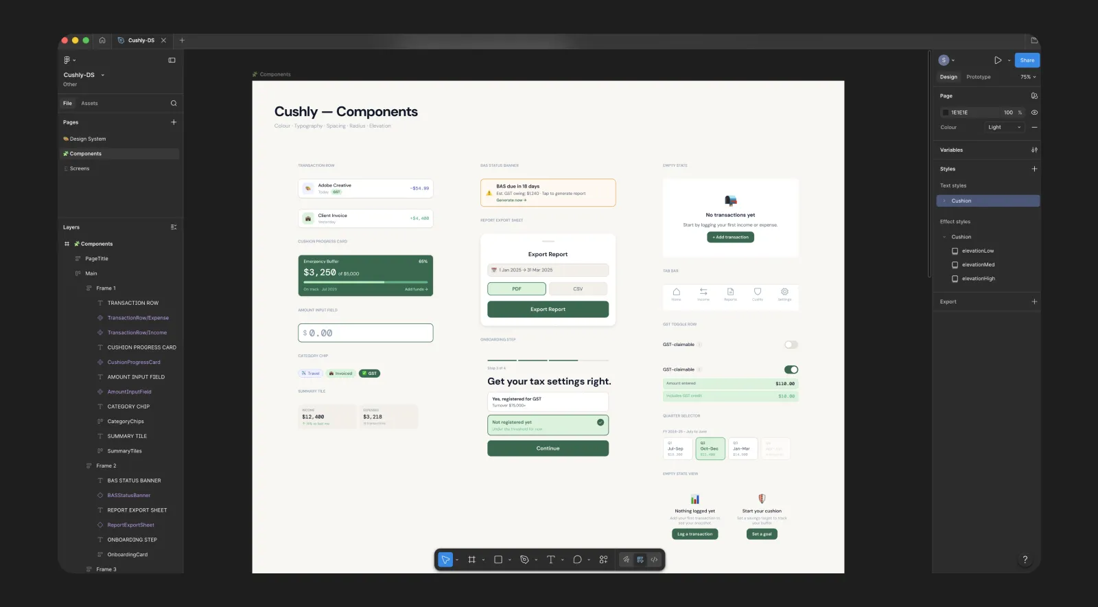
Figma DS - Components
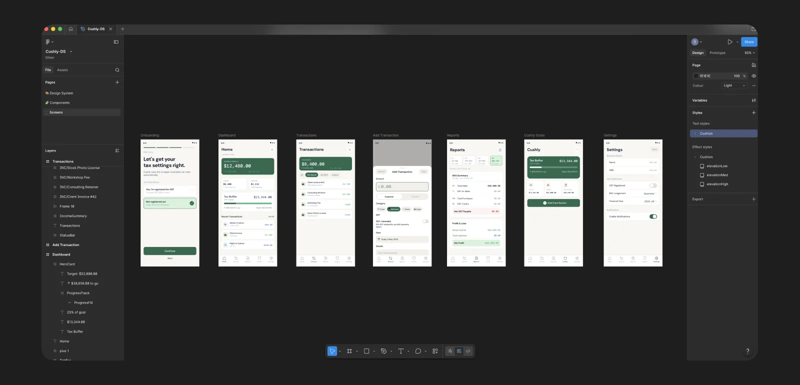
Figma DS - Screens Light
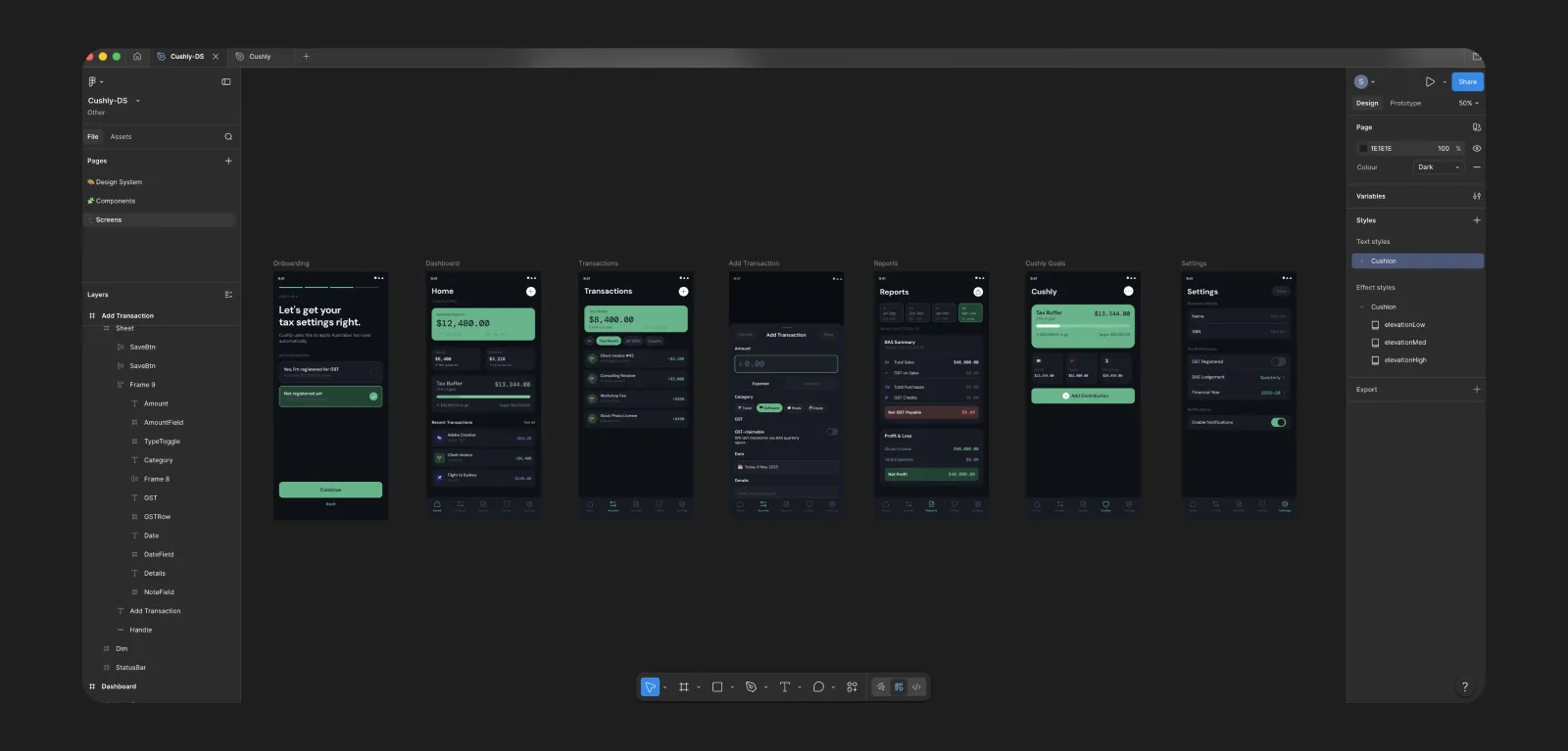
Figma DS - Screens Dark
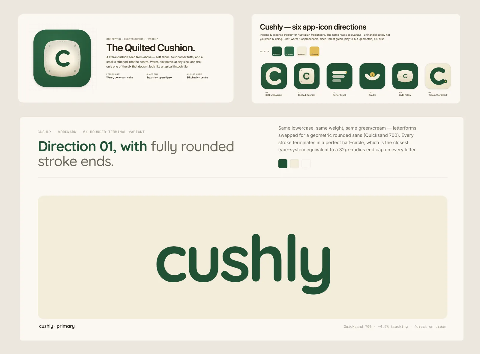
Branding
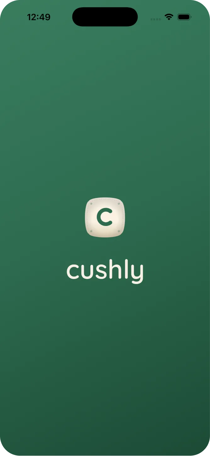
To strengthen the app’s branding and personality, I used Claude Design to produce high-quality logo variations. Through iterative refinements, I developed a polished logo optimised for the app icon and splash screen.
From screens to a hands on prototype.
Key Goals
Write the copy that makes the product feel human, turn the design into a clickable prototype using Claude Design, then put it in front of real users to find out where it breaks.
Core Tasks
Write screen-level microcopy for five critical screens
Feed screen specs and design tokens into Claude Design
Generate a fully interactive prototype with real navigation and states
Define five scenario-based usability tasks with success criteria
Run moderated sessions, log friction, and iterate on findings
Deliverables
Complete microcopy for all primary screens and states
Clickable Claude Design prototype covering all five core flows
Prototype shared as a testable link with no design tool access required
Iterated screens fed back into the build phase
AI Tools & My Role
Claude wrote the copy from a tonal brief I defined. Claude Design took the screen specs and generated the interactive prototype. I reviewed every flow for fidelity and corrected navigation logic.
Tasks & Results
Tasks were given to users with no guidance or walkthrough. Sessions were moderated, and friction points logged. The goal wasn't to confirm the design worked; it was to find out where it didn't.
Complete onboarding as a new user
Log a GST-claimable expense
Check your tax liability
Generate a BAS summary
Set a savings goal
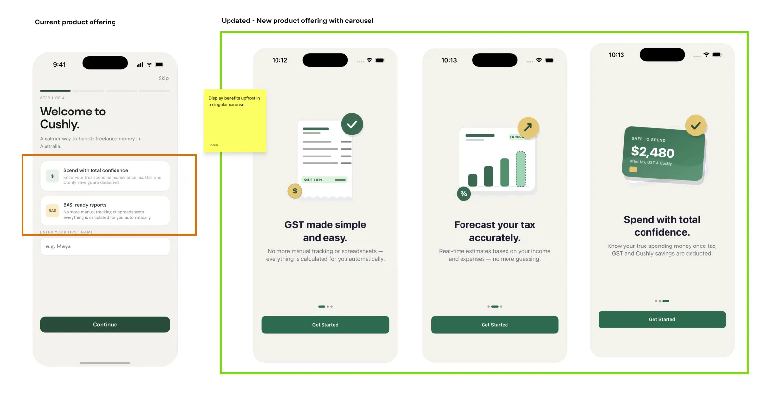
Testing revealed that many people didn’t immediately understand the app’s value, as the key value propositions were being missed on the first screen.
To solve this, I separated the value propositions into a dedicated carousel placed before the onboarding flow. This allowed users to clearly understand the benefits upfront.
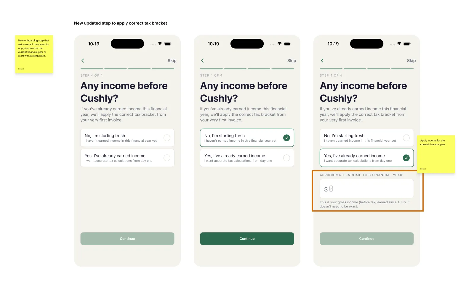
New users were confused about why tax brackets weren’t being applied to their income when starting fresh. In Australia, individuals are only taxed once they earn above the $18,200 tax-free threshold for the financial year.
To fix was to add a new onboarding step that asks users if they want to apply income for the current financial year or start with a clean slate. This provided clear context and reduced confusion.
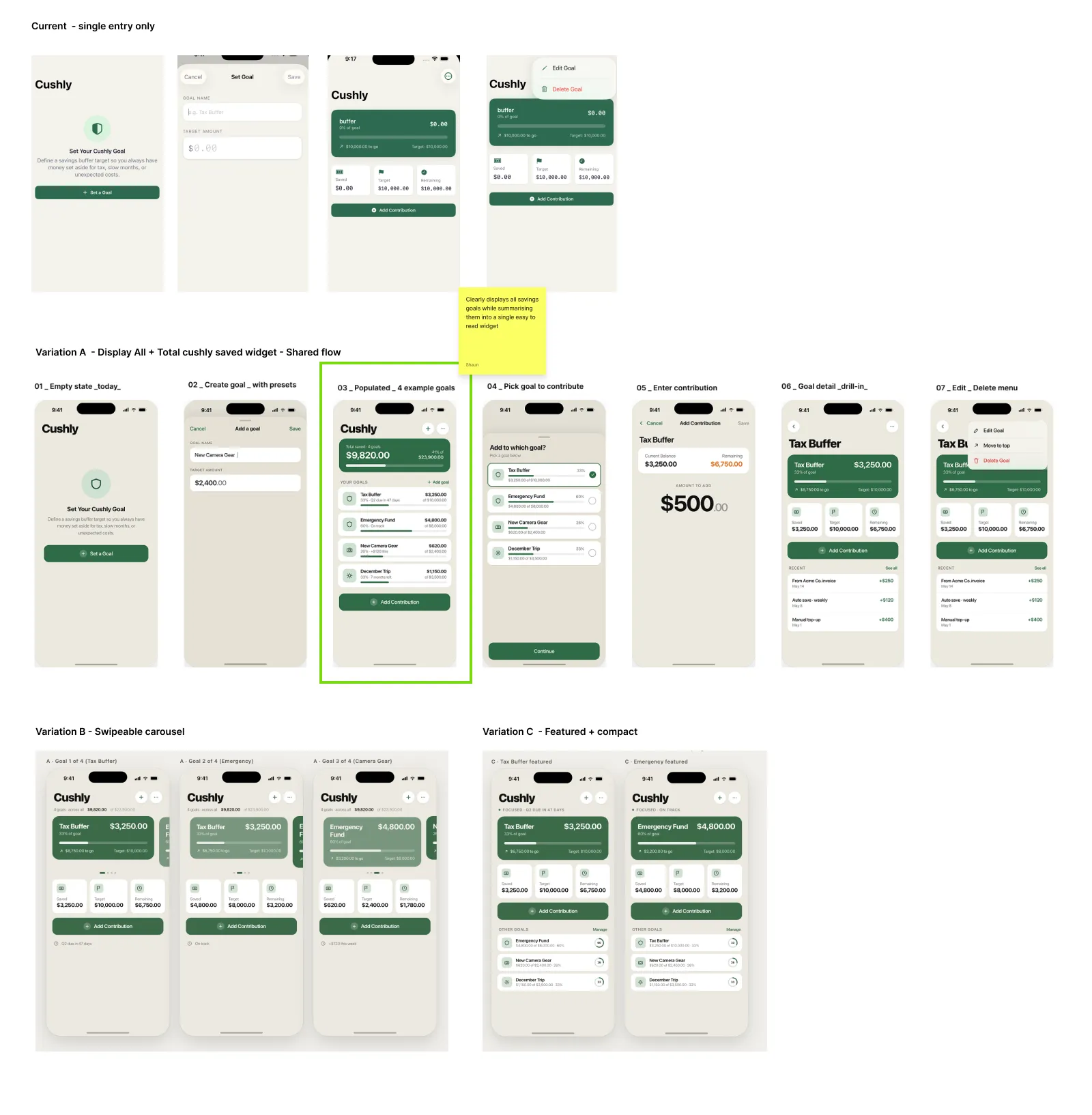
Testing revealed that people wanted the ability to save multiple goals, rather than being limited to just one.
I presented the problem to Claude Design and explored several design variations for how best to present and manage multiple savings goals in the interface. This helped me quickly identify the clearest and most intuitive solution. Variation A proved to be the most intuitive solution. It clearly displayed all savings goals while summarising them into a single, easy-to-scan widget.
From specification to codebase.
Key Goals
Translate all prior specifications into a production SwiftUI codebase. Every architectural and design decision from earlier phases is executed here. No new decisions, just precise implementation.
Core Tasks
Scaffold the full MVVM project structure with SwiftData persistence
Implement design system with all colour tokens, type styles, and spacing
Build SwiftData models for Transaction, CushlyGoal, and UserProfile
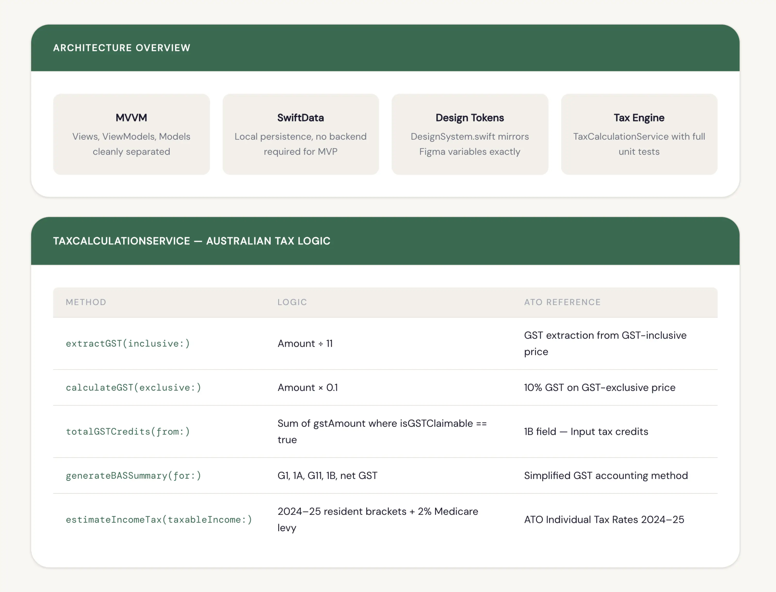
Implement the Australian tax calculation engine with BAS report generation
Deliverables
Complete SwiftUI MVVM project with zero third-party dependencies
Design system matching Figma token names exactly
Working tax engine with ATO bracket logic and GST handling
BAS summary generation from real transaction data
AI Tools & My Role
Claude Chat handed off to Claude Code at this phase, a deliberate switch to a tool that operates directly inside the Xcode codebase. Every prompt was a specification, not a brief. I authored each spec, reviewed all generated code for correctness, verified the tax logic against ATO documentation, and directed iteration when outputs didn't meet the requirements.
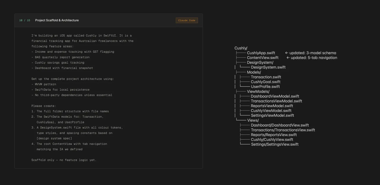
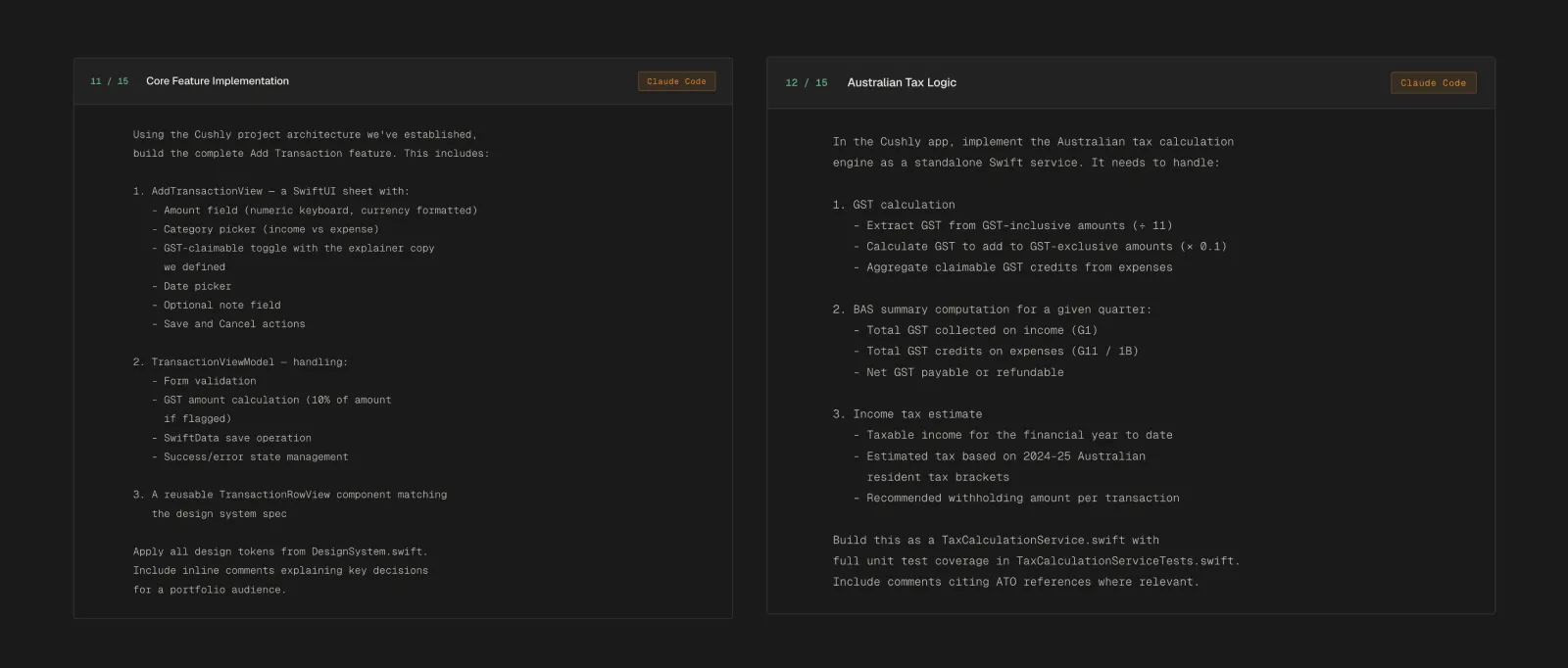
Claude Code scaffolds the complete MVVM architecture, implements the design system, and builds every feature from specification.

Xcode - Design system
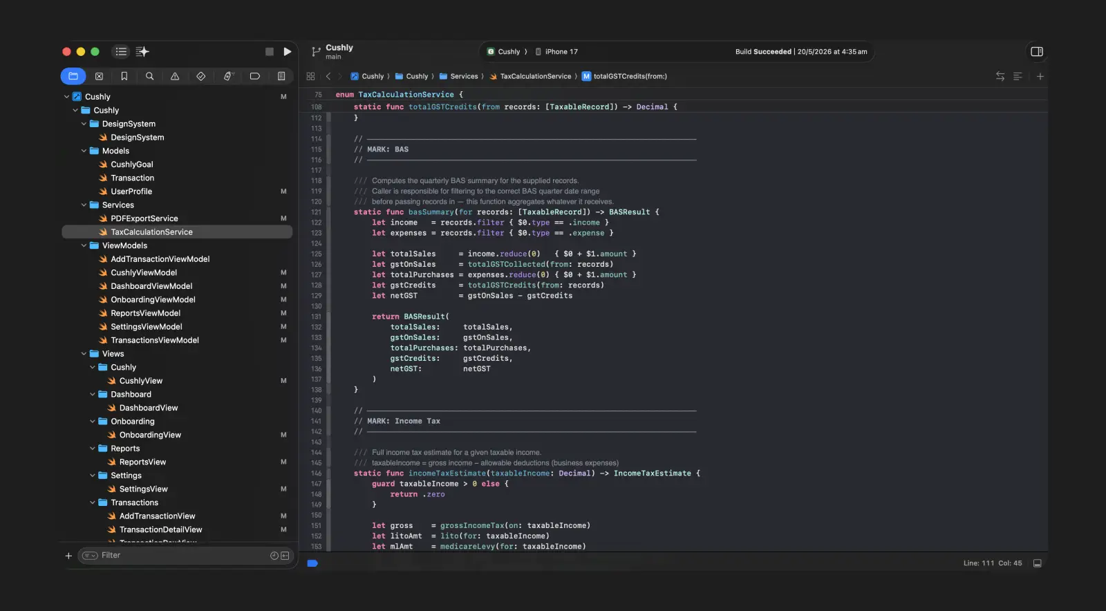
Xcode - ATO calculator tax engine

Xcode - Dashboard screen

Xcode - Reports screen

Xcode - Final design screenshots
AI-generated code still needs a critical eye.
Key Goals
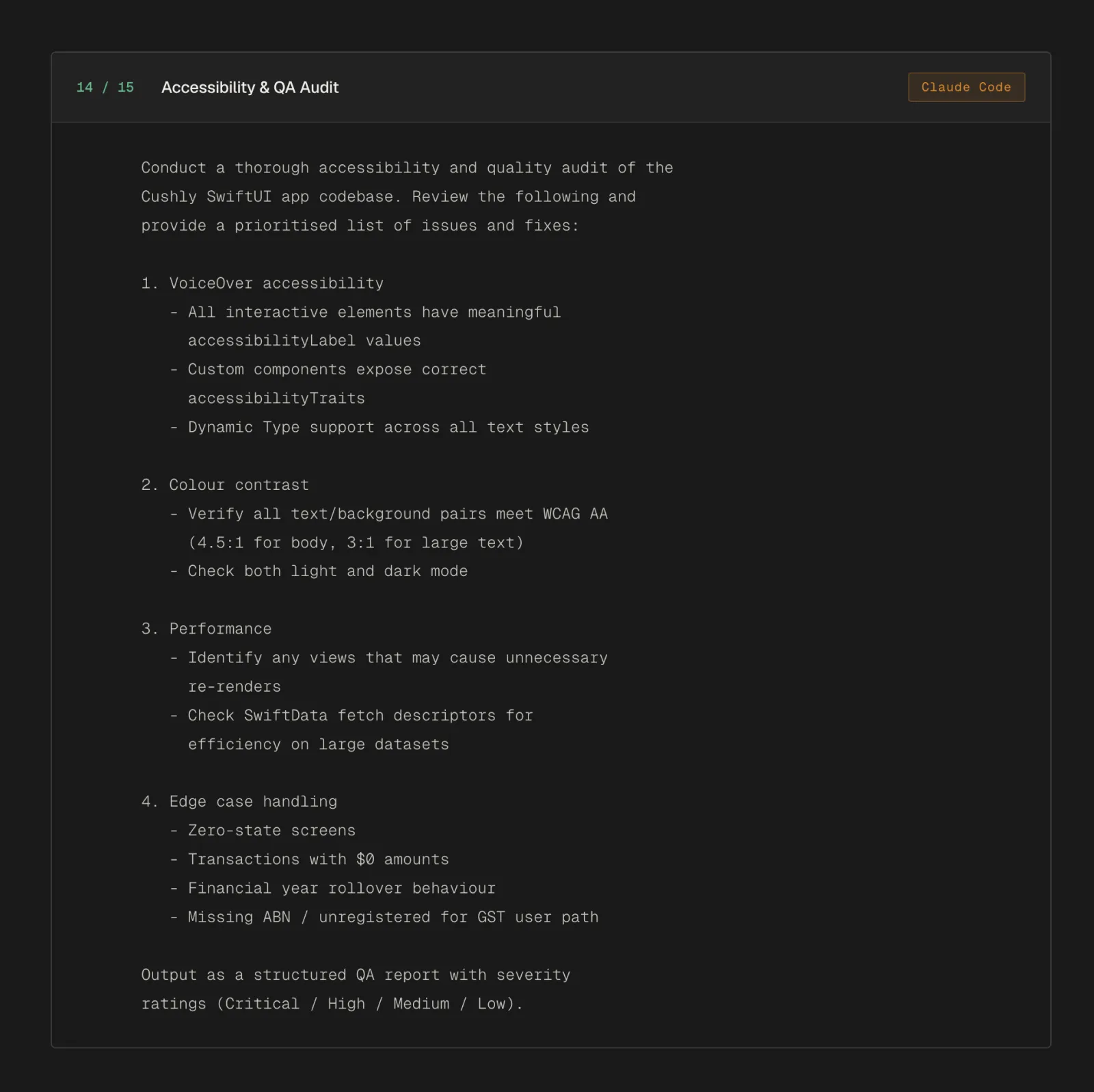
Run a structured audit of the completed codebase across accessibility, contrast, performance, and edge case handling. Surface real issues with severity ratings and specific fixes, not a general review.
Core Tasks
Audit VoiceOver labels, Dynamic Type support, and tap target sizes
Check all colour combinations against WCAG AA contrast thresholds
Review SwiftData query efficiency and view re-render patterns
Test boundary conditions: empty states, invalid input, quarter rollover logic
Rate every issue Critical / High / Medium / Low with a fix recommendation
Deliverables
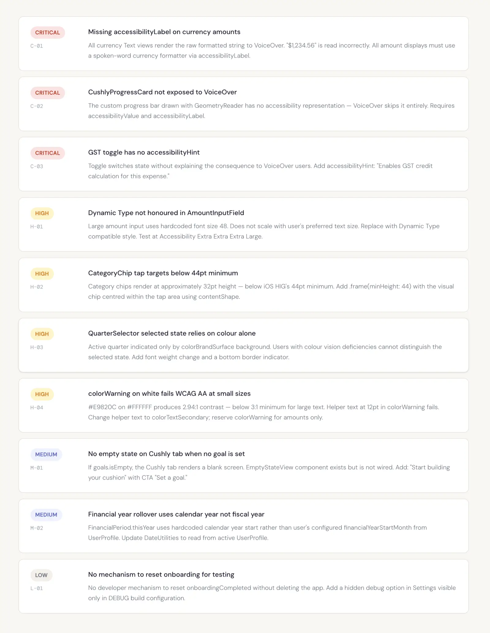
Severity-rated QA audit covering 4 evaluation dimensions
Accessibility issues with specific SwiftUI fix recommendations
Contrast failures identified with corrected token values
Performance findings with targeted optimisation notes
Edge case report covering all identified boundary conditions
AI Tools & My Role
Claude audited its own build output against a precise set of criteria I defined: WCAG AA thresholds, iOS HIG tap target minimums, and a severity taxonomy. I reviewed every finding for validity, verified the accessibility issues against real VoiceOver behaviour, and made the final call on priority and fix approach for each item.
A structured QA audit covering accessibility, colour contrast, performance, and edge case handling. Severity-rated and prioritised.
OUTCOME & LEARNINGS
What this workflow actually changed.
An honest look at what AI-augmented design practice actually feels like from the inside — what it accelerated, what it couldn’t replace, and what it taught me.
On Cushly I worked with AI tools as genuine collaborators — not just smarter search engines or code autocomplete. The designer’s role didn’t shrink. It shifted. I spent way less time churning out documents and way more time making decisions, judging quality, and keeping the product strategically coherent so it actually felt intentional instead of just assembled.
This shift isn’t some temporary hack or niche experiment. It’s the direction the whole practice is heading. The designers who’ll do the most interesting work in the next decade are the ones who learn to direct these tools effectively.
Outcome
Phases that would traditionally take weeks of documentation were wrapped up in just days - without losing any depth or strategic clarity.
I shipped a production-quality SwiftUI codebase (full tax engine, SwiftData models, and a complete component library) as a solo designer with no dedicated engineering partner.
Everything stayed consistent end-to-end: design principles fed straight into the system, which fed straight into the code. Almost zero handoff loss.
Learnings
Prompting is a design skill. The quality of every output was directly proportional to the quality of the specification. Domain knowledge mattered enormously.
Al cannot generate novelty from nothing. Every distinctive decision - the emotional positioning, the Cushly concept as a product pillar - came from the designer, not the Al.
Review is not optional. The QA audit surfaced real accessibility failures and performance issues present in Claude Code's output. Al-generated code is not self-correcting.
"The question is no longer whether AI will change design practice — it already has. The real question is whether designers will lead this transformation, or be left behind by it."
DOWNLOAD APP
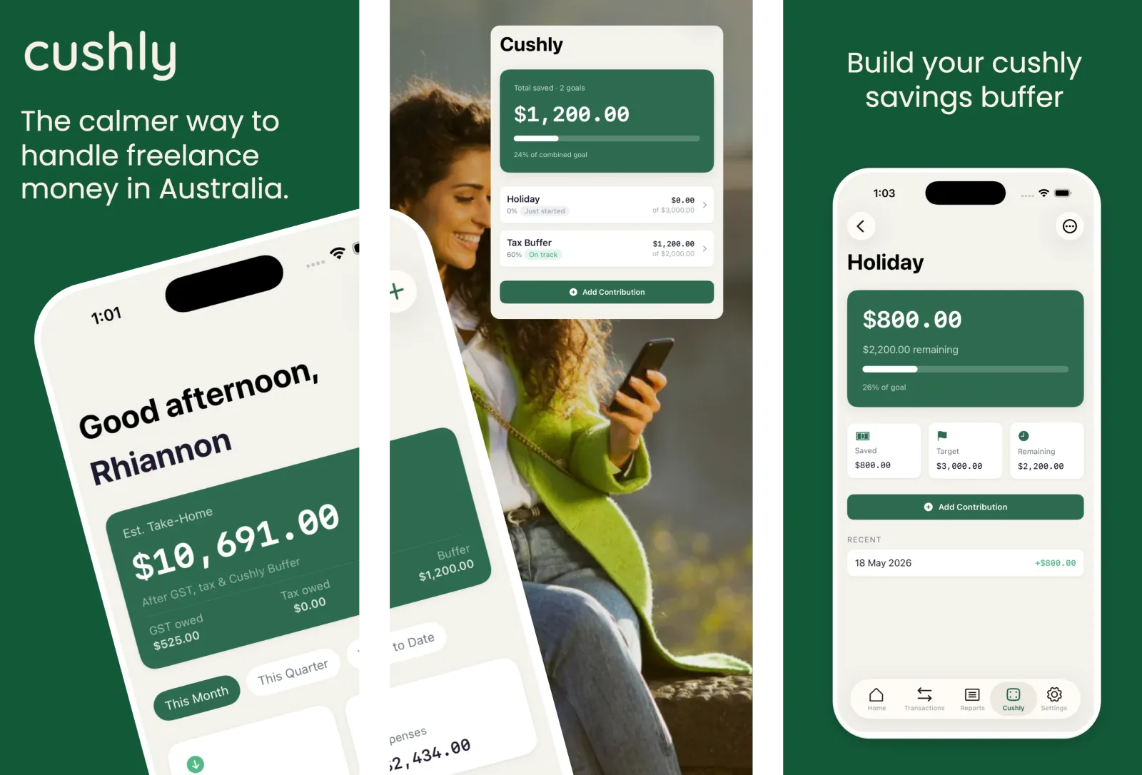
Download Available (Australia only)