Carsales Retail - Platform Redesign & Design System
End-to-end redesign of the Carsales native app and web platform, paired with a Figma design system built for team-wide adoption.

At a glance
Redesigned core retail flows across web and app. Built a scalable Figma design system from scratch. Cut new screen creation time by 40% and onboarding time by 3×.
Role
UX / UI Designer
Company
Carsales
Platform
iOS Native & Web
Date
Feb 2021
OVERVIEW
Modernising Australia’s leading automotive marketplace
Carsales is Australia’s largest online automotive marketplace. When I joined this project, the retail experience across web and native apps had grown inconsistent — every new feature started from scratch, and handoffs to engineering were slow and error-prone.
I led a focused redesign of the core retail experience and built a comprehensive Figma design system the entire design team could adopt. The goal was simple: one consistent experience for users, and one reliable source of truth for designers and developers.
THE CHALLENGE
A fragmented design process slowing everyone down
No unified design system — every project started from a blank canvas
Inconsistent visual styles and interaction patterns across web and apps
Designers and developers repeatedly rebuilding the same UI elements
Slow, error-prone handoffs between design and engineering
Steep learning curve for new designers joining the team
MY ROLE & APPROACH
Two parallel tracks: experience redesign and system foundation
What I owned
I led the end-to-end retail redesign and designed and implemented the Figma design system single-handedly. My work covered the home screen, search, listing cards, enquiry flows, and the component library the wider team used day to day.
What I delivered
1.
Retail experience redesign — home screen, search, listings, and key user flows across iOS, Android, and web
2.
Figma design system — a scalable component library structured around atomic design, adapted so the team would actually use it
01 — DISCOVERY
Auditing the platform and mapping a better structure
I started with a full audit of the existing web and app experience — reviewing current screens, identifying inconsistent patterns, and mapping where users dropped off or worked harder than they needed to.
From there, I created low-fidelity wireframes to explore information hierarchy, test layout options, and align stakeholders on direction before moving into high-fidelity design.
Key outcomes from discovery
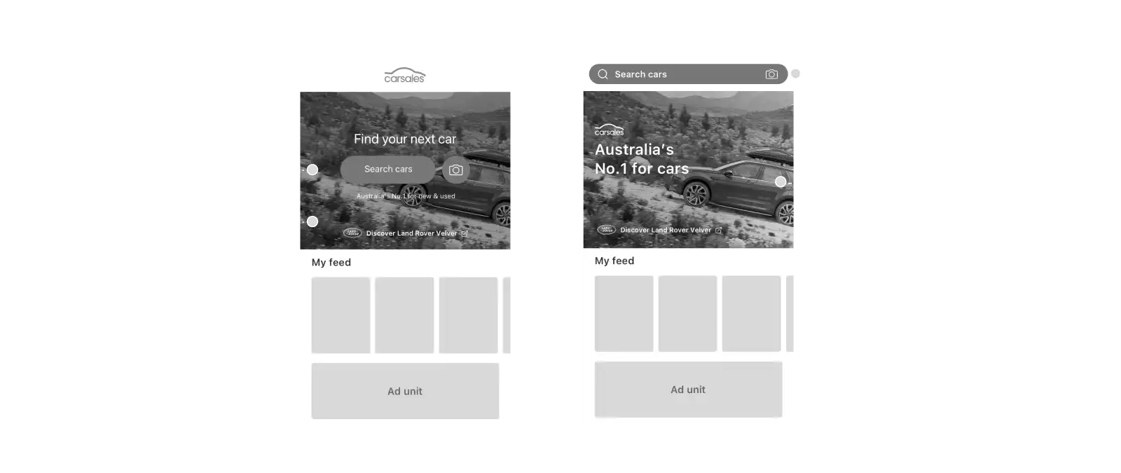
Home screen redesign — docked search bar and enhanced hero content for faster discovery
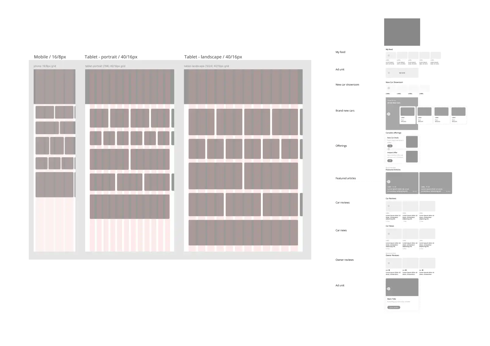
8-column grid system — flexible, consistent layout foundations across breakpoints
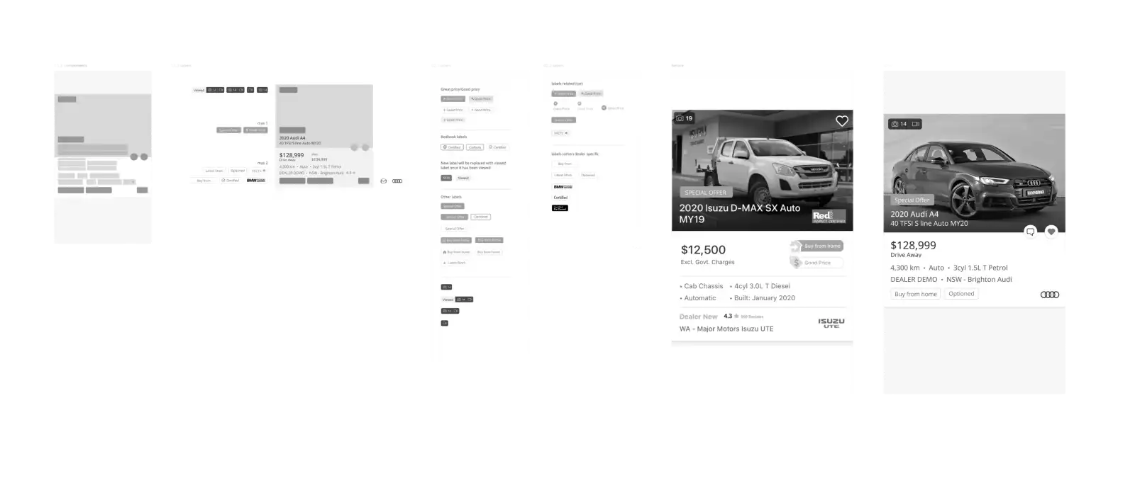
Listing optimisation — cleaner cards, improved image treatment, streamlined enquiry flow
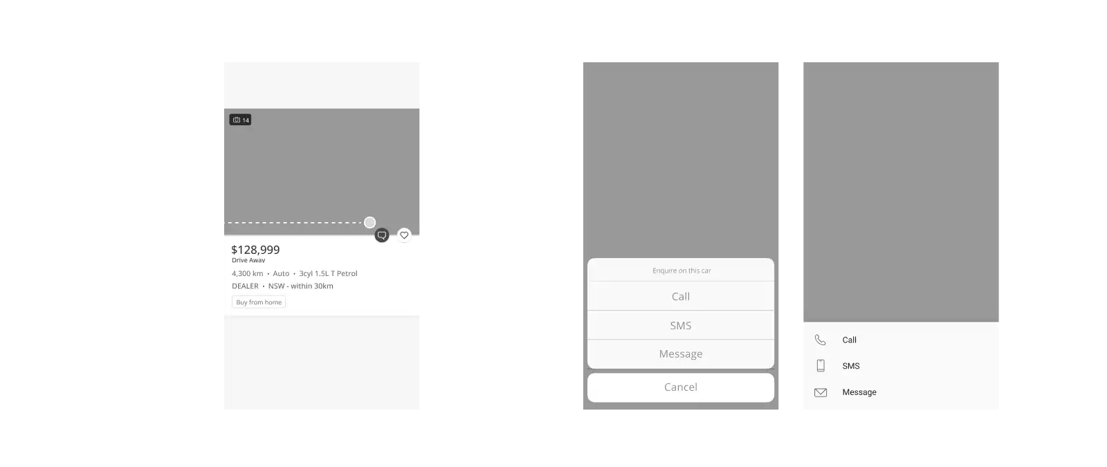
Inline listing enquiry — contact a seller directly from the listing card, without visiting the detail page
02 — DESIGN DECESIONS
Defining the retail experience
Docked search on the home screen
Users previously had to scroll back to the top of the home screen to start a search. I introduced a docked search field that stays accessible as users browse — so discovery never gets interrupted by navigation friction.
Relocating a promotional action off the main ad unit also gave the hero placement more visual clarity, making both the ad and the search entry point easier to find.
8px grid and browsing components
I applied an 8px grid system across the home screen and core browsing patterns. Where existing components still worked well, I retained and refined them rather than redesigning for the sake of it — consistency with evolution, not a clean-slate reset.
The grid gave designers and developers a shared spacing language, which made cross-platform layouts faster to spec and easier to review.
Listing card optimisation
The existing listing card carried the right information but felt cluttered and dated. I standardised the core elements — image, price, key specs, and actions — so cards scanned faster without losing any critical detail.
Enquiry from the listing card
The biggest flow improvement was letting users enquire about a vehicle directly from the listing card. On mobile, tapping the enquiry action opens a bottom sheet with three options: Call, SMS, and Message. On desktop, the same action surfaces as an inline panel to the right of the card.
This reduced the steps between browsing and contacting a seller — a small interaction change with a meaningful impact on conversion intent.
03 — DESIGN SYSTEM
Building a system the team would actually use
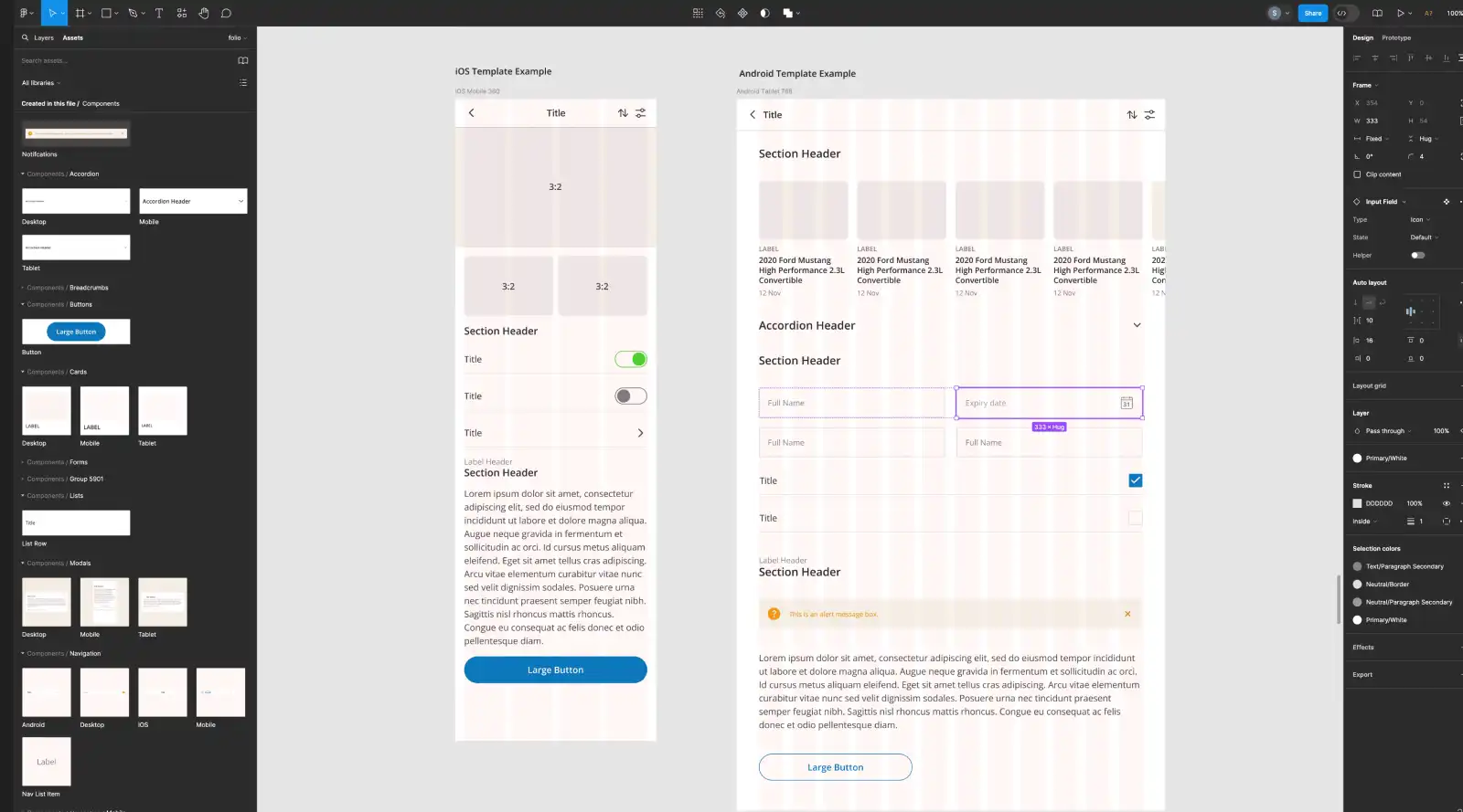
With the retail flows taking shape, I built a standardised set of UI components to keep web and app experiences aligned and make future updates scalable.
I structured the library using atomic design — atoms, molecules, organisms, templates, and pages — because it scales cleanly as products grow. But after talking with the design team, I renamed the Figma file pages to Elements, Components, Widgets, Templates, and Pages. The original atomic labels confused people; the new names matched how the team already thought about their work, and adoption followed.
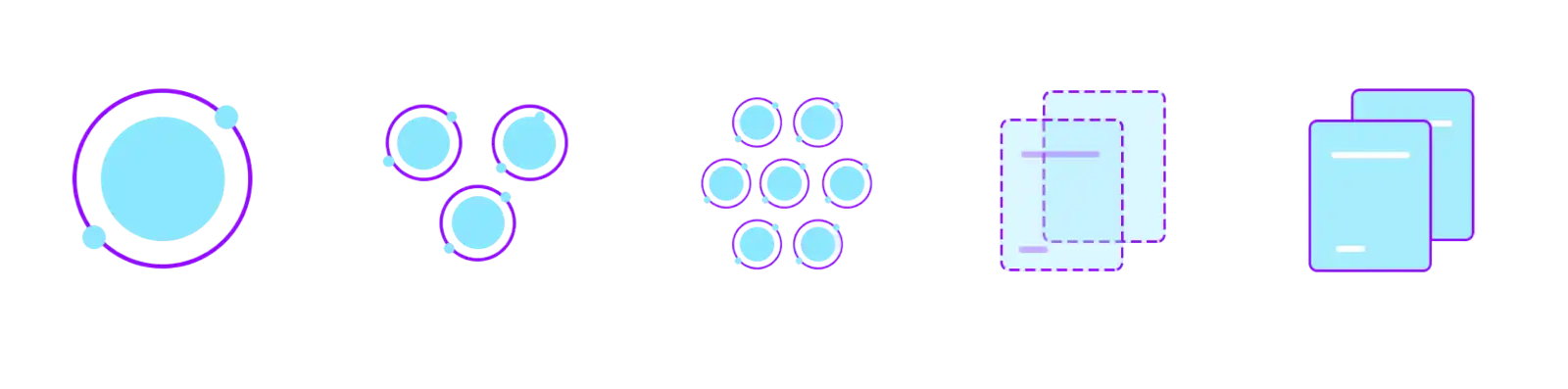


A design system is a product that serves your product team. Getting the naming right — Elements, Components, and Widgets instead of Atoms, Molecules, and Organisms — wasn’t a small detail. It determined whether the team actually adopted it.
— Key learning from this project
What the system included
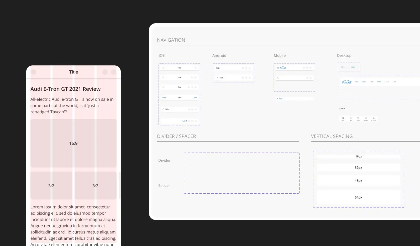
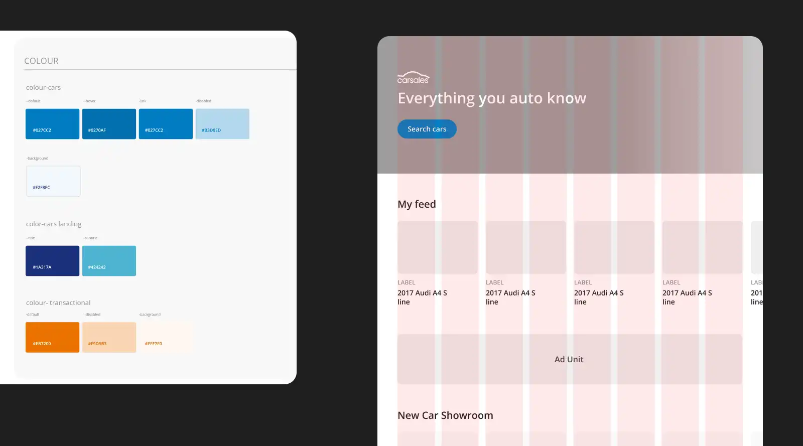
Typography scale and usage guidelines
Colour system with accessibility considerations
Button, form, and input styles
Custom icon library
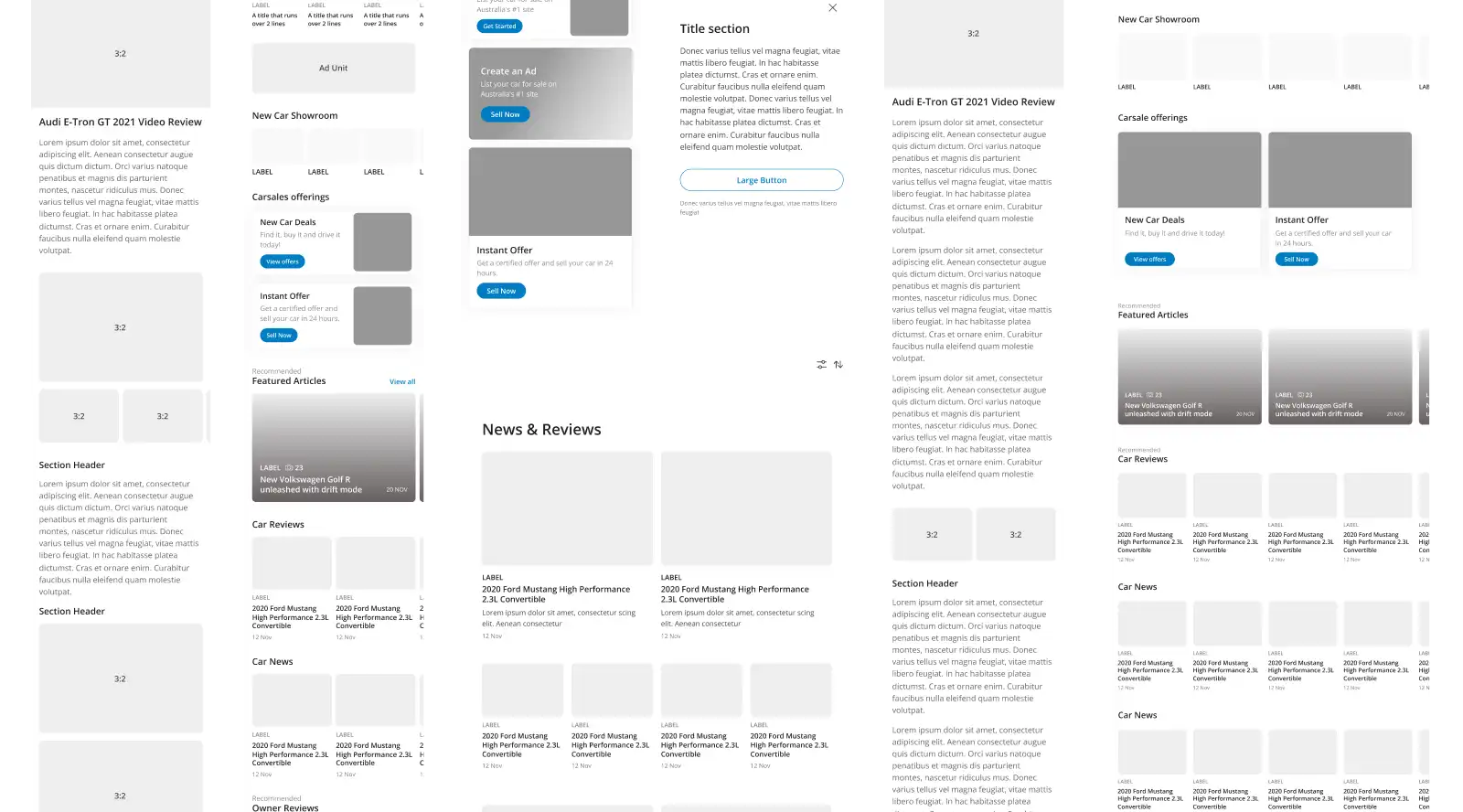
Cards, modals, navigation, and section headers
Responsive grid system and spacing rules
Integration
The system was fully documented and published as Figma libraries with drag-and-drop components. Designers could assemble new pages in minutes using pre-built templates, which cut design time and kept specs aligned with what engineering built.
04 — FINAL DESIGNS
Designer handoff
I created detailed specifications, interactive prototypes, component documentation, and a centralised Figma handoff kit.
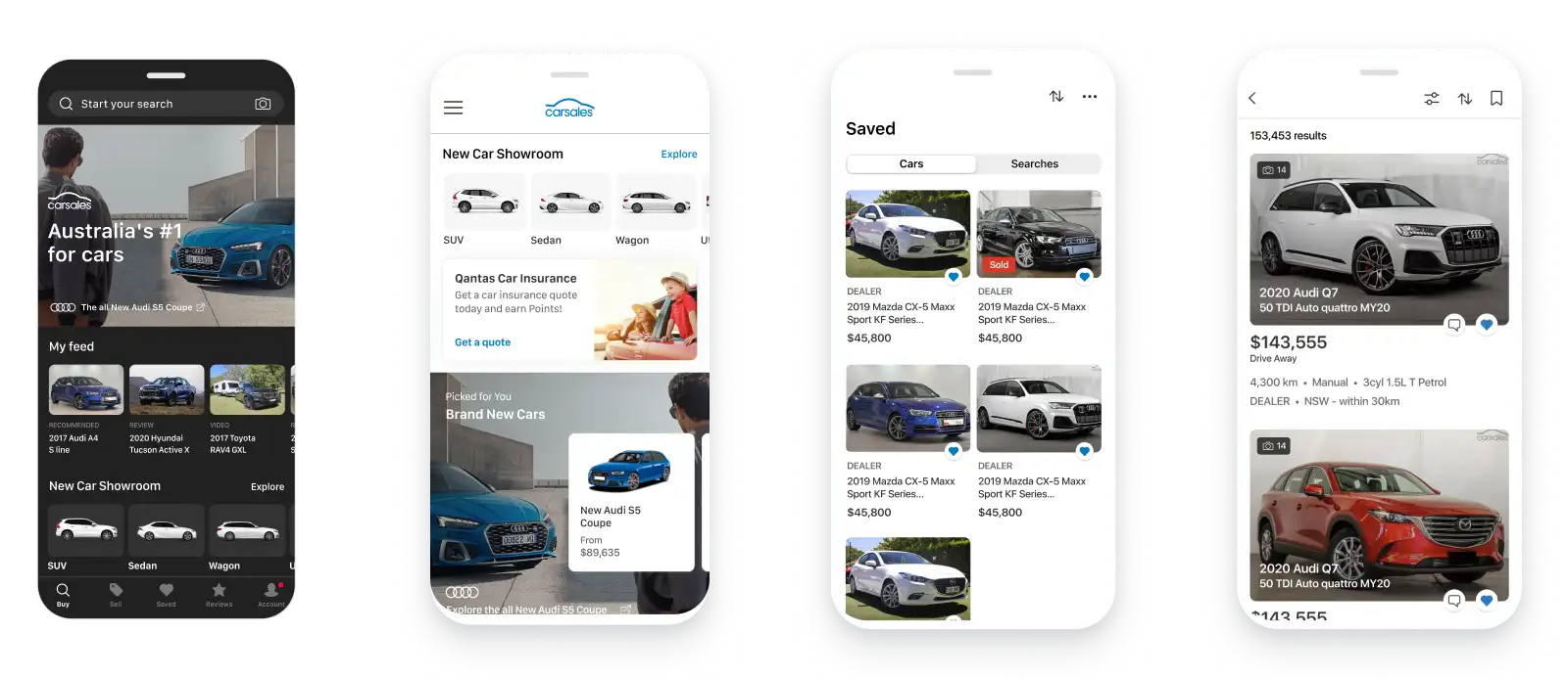

iOS prototype (1:17 mins)
05 — OUTCOME & IMPACT
A foundation that outlasted the project
The redesign delivered a more intuitive retail interface with a consistent look and feel across web and app. The design system became the team’s primary source of truth for UI — not just for this project, but as a foundation for future features with minimal rework.
Several patterns from this work — including listing card structure and enquiry flows — have since appeared in the live product.
Atomic
5-layer design hierarchy
8px
Grid across all breakpoints
All platforms
One design system, every product
Drag & Drop
Components for every designer
Measured Impact
40%
Faster creation of new screens and features using the design system
3x
Faster designer onboarding — productive in days, not weeks
06 — NEXT STEPS & LEARNINGS
Storybook Integration
I began developing several frontend UI components using React and then utilised Storybook to showcase these components, complete with detailed documentation for their use across various platforms. I was unable to locate this work, as it was hosted on a secure server that I no longer have access to.
Atomic Design works at scale
Breaking everything into its smallest reusable parts made the system extremely flexible without sacrificing consistency.
The 8px grid is a communication tool
Its real value wasn't just visual consistency — it gave designers and developers a shared language that reduced back-and-forth during handoff.